The mobile Web has been expanding at an amazing rate and that has prompted Google to help publishers to provide a better mobile experience to their users.
In order to achieve this, Google has added a new feature that will enable automatic mobile rendering of Google Sites for iOS 3.3+ and Android 2.2+ devices.
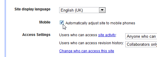
In order to use this feature, Google Site admins need to go to ‘general settings’ under More actions > Manage site and click on ‘Automatically adjust site to mobile phones’. Once this is done, the Google Site will automatically be adjusted when it is viewed via an iOS or Android 2.2 device.
When this new feature is activated:
- The header layout and top bar will be automatically aligned
- The width of the site will match the device
- Sidebars will be smartly handled and horizontal navigation and dropdown links will be available.
In order to preview the page from the computer as a mobile viewer, users can click on More actions > Preview as viewer (Mobile). Webmasters will even have the option to save some vertical space in the footer by hiding some of the links.
To further help publishers to find their sites even when they are on the go, Google has also added mobile versions of the site list, sites search, and browse sites categories.


