by: accuracast
Identify Market Trends With Big Data [Step 3]
This is the third of a 5-part article on how regular marketers can use Big Data to improve campaign performance. If you’ve missed the first two steps, you should start here. In the first part we looked at ways to access all the data available to most businesses, and segmenting that data to work with a meaningful subset. In the second part we looked at smarter ways to analyse big data. Here we will look at ways to identify market trends from your data.
Step 3: Start identifying trends
This is where the fun begins! You’ve segmented your data, performed a two- or three-level analysis, and can now start looking at the results and inferring trends.
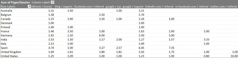
A word of caution: always ensure that you’re working with a sensible sample size. In other words, don’t jump to conclusions based on a small sample of data. In the pivot table below, you’ll see a very high number of pages per session for referrals from Twitter in the USA. However, this number was an average calculated from a very small set of users, one of whom skewed the data drastically.
Minimum sample size
Logically, the next question is: How big is a “sensible” data sample? The short (and much hated) answer is, “it depends”. A sample size of just 20 users may suffice if each and every user in the sample conforms to the same behaviour. On the other hand, when analysing conversion statistics for an average business with 4% conversion rates, you might find that you need at least 200 conversions, which may translate to a minimum total sample of 5,000 users. As a general rule, the larger the sample size, the more confident you can be with your analysis.
For hardcore data scientists, the formula below calculates the minimum sample size for a certain level of confidence. Most marketers can use simpler calculators to determine the minimum sample size they should work with.
Necessary Sample Size = (Z-score)2 * StdDev*(1-StdDev) / (margin of error)2
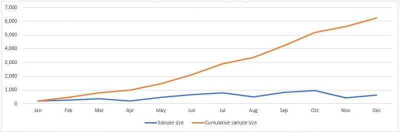
Collecting enough data can be a challenge for smaller businesses as well as for marketing teams in large enterprises that work in the B2B space or in niche industries. The easiest work-around is to consider data over a longer time period. As you can see in the graph below, even a small monthly sample size can quickly add up to a statistically significant data set in just a few months.
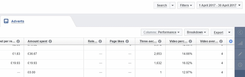
 Looking at a fairly large data set from a Facebook advertising campaign, we can spot definite characteristics of certain audience groups. Accessing such data on most modern ad networks like Facebook, DoubleClick, and even Twitter, is fairly straightforward. The trick is to customise the columns of data beyond the defaults presented by the network, and then export that data, all at once or in distinct chunks split by periods of time (days, months, quarters), as shown in the animated gif below.
When each month of this data set is then analysed using pivot tables, it becomes fairly easy to spot groups that under-perform or outperform the rest. If this behaviour is seen repeatedly over a period of time, or is found to be steadily increasing or decreasing over a period of time, that is likely to indicate a trend in your data.
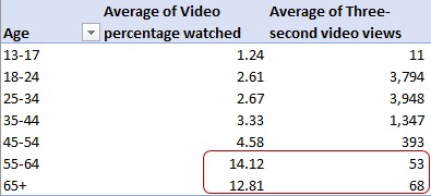
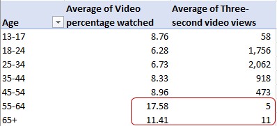
In the images below, we see data from 2 months compared side by side on individually processed pivot tables. In both months two demographic groups have the highest average video percentage watched, and two demographic groups have the highest number of views. These data points could indicate a trend, which can be verified by reviewing the same data over a few more months.
Trending changes and seasonality
Changes to consumer behaviour that occur regularly at certain times of the year are attributed to seasonality. It is important to understand such data variations, and to account for trends leading up to such seasonal changes in behaviour as well. A simple example that most marketers are aware of is the Christmas shopping season. While the months of November and December are well documented, the trends leading up to that period should also be analysed as they may indicate changes in consumer behaviour linked to how, where, and when they browse and finally shop for the Christmas season.
Importance of persistence
A sudden spike in performance data does not imply a trend, and it is very important for marketers to understand that difference when analysing data. Even if the spike represents a big sample and all the users in that sample conform to a certain behaviour, this might not be a trend that can be replicated beyond the confines of that specific set of data.
Surges in traffic due to coverage in a national newspaper or popular site often fall under this pattern. The graph below shows the number of searches on Google for ‘Pokemon’ in the last 12 months. Anyone who wasn’t living under a rock in the past year would know that last summer was when the mobile augmented reality game Pokémon Go was released, which corresponds to the massive spike in search volumes.
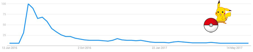
Expecting that trend to repeat this summer would be foolish, since the spike was directly related to the launch of the game, and cannot be expected to repeat itself unless something equally ground-breaking happens again.
The next article in this series will talk about discovering the sources and influencers of change with big data.
About the Author
Accuracast is a digital marketing agency focused on international growth. Founded in 2004. Specialists in generative AI engine optimization, social media marketing, search and programmatic display advertising and search engine optimisation in all major global languages to businesses worldwide. Offices in London, New York and Madrid.