by: accuracast
Improve Marketing Decisions With 2-Level Big Data Analysis [Step 2]
This is the second of a 5-part article on how regular marketers can use Big Data to improve campaign performance. If you’ve missed the first part, you should start here. In the first part we looked at ways to access all the data available to most businesses, and segmenting that data to work with a meaningful subset. Here we will proceed to analyse that data.
Step 2: Analyse performance at two levels
Elementary physics teaches us about cause & effect. When analysing data, you always need to identify a cause that leads to a certain result or “effect”. One of the biggest mistakes a lot of seasoned marketers make is to look at performance at just one level and draw inferences based on that. It’s a really easy mistake to make, but the resulting inferences and actions taken can be pretty serious.
Let’s consider a simple example: A marketing executive is analysing ad performance in AdWords. He drills down to an ad group and looks at the 5 ad variations within. By very quickly looking at the stats, he identifies 2 ads that perform at a significantly lower CTR and have no conversions. Naturally, he pauses those 2 and leaves the other 3 running. While this may seem like a sensible way to approach campaign optimisation, it ignores the causality – i.e. what caused those ads to have such a low CTR? It happens all too often that the ads that were paused might actually be the top performers in another ad group, leaving marketers perplexed as to what caused the poor performance in one set of ad groups.
The correct way to analyse the performance in the above example would have been to review the keywords and search queries alongside the ad variations to identify why the usual top performers were under-performing in this particular instance.
Simple multivariate data analysis tool
One of our favourite tools when carrying out such analysis is the good old Pivot Table. The image below shows a pivot table that answers the question “which source sends the most sticky traffic (most pages per session) in each of the main target markets?”
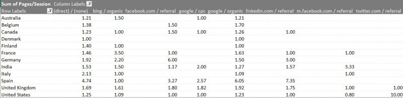
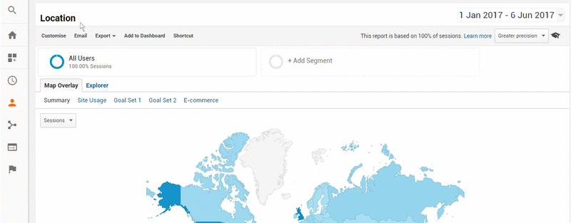
Pivot tables allow you to easily add a second layer of complexity into your data analysis. For the above example, we looked at the Locations report in Google Analytics, added a secondary dimension to the report, and exported it to Excel. The pivot table built on this data shows that in the UK, the most engaged users come from Facebook and Google ads, whereas in the USA organic search referrals were more engaged with content on the site. The animated gif below shows the steps to obtain such data.
The next article in this series will talk about identifying trends in big data.
About the Author
Accuracast is a digital marketing agency focused on international growth. Founded in 2004. Specialists in generative AI engine optimization, social media marketing, search and programmatic display advertising and search engine optimisation in all major global languages to businesses worldwide. Offices in London, New York and Madrid.